Conducted 3 rounds of user research to improve the user experience with library search.
Summary
- Brigham Young University Library needed to update its search interface due to issues with integrating third-party software
- Technical limitations led to the creation of a two-tabbed search
- I conducted 3 rounds of testing and made crucial recommendations to bring interface in line with user expectations
Project requirements
The BYU Library website search was not coming up with the search results that users expected. This was due to the “blending” of content the library owned with content from third-parties it subscribed to. The library does not have as much control over the content it does not own, but removing it would decrease the the usefulness of the library website for patrons.
Design process
iteration 1: in the library vs. external wireframes
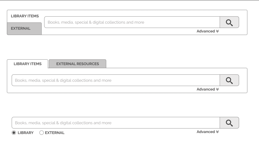
The senior designer created wireframes that split the search results into two tabs. This allowed the search results to be sorted in a way that pushed the most relevant results to the top of each tab.
Method
- User interviews–asked participants to tell me what content they thought would be in each tab
Feedback
- Participants did not understand what would be in each tab. Since many participants thought the tabs were separating physical from digital resources, I created this image to include in my report to the senior designer:
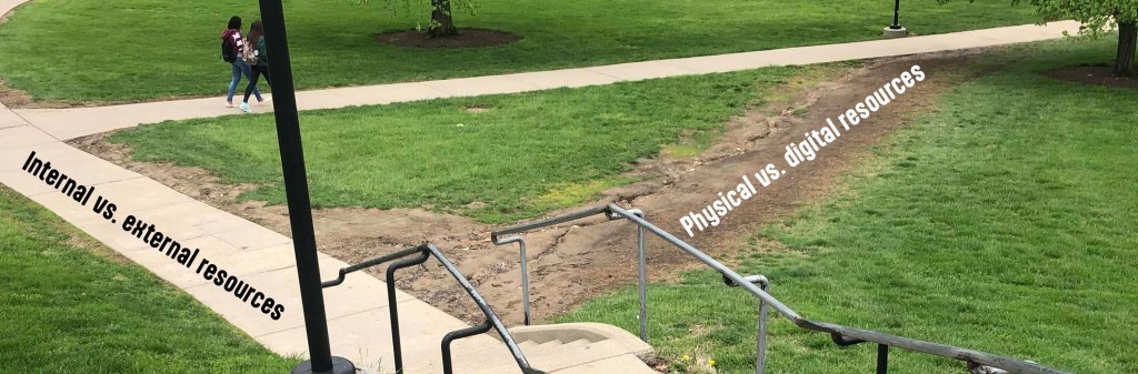
- The participants had created a desire path for us to design around. Because so many participants had independently asked if the tabs were organized by physical vs. digital resources, I strongly recommended to the senior designer that we change the interface to meet their expectations.
Iteration 2: In the library vs. available online
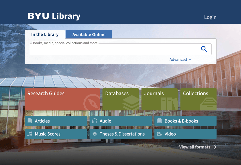
The senior designer listened to my recommendations and worked with developers to create a search that sorted by physical vs. digital resources. We hoped this would align with user expectations while still allowing for better search results.
Method
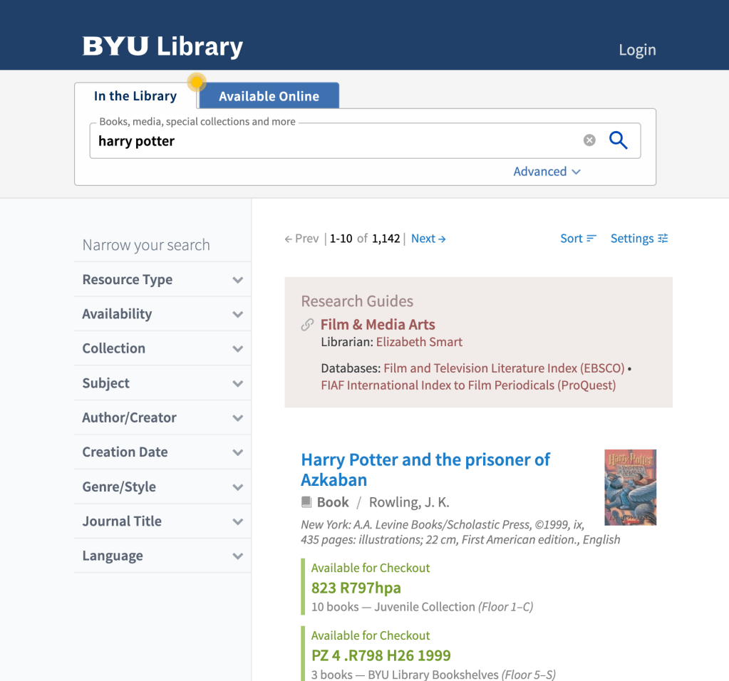
- Usability tests with functioning software–asked users to search for and find find content that was only in one tab or the other
Feedback
- Users were missing important content that was only available online. They would check the In the Library tab and if they did not find the content there, they would give up.
- When asked about the Available Online tab, participants would say they never noticed it.
iteration 3: hotspots and tutorial
After learning that users were missing out on important content from the Available Online tab, the senior designer worked with developers to create hints for users. They created a hotspot that would blink on the Available Online tab to hint to users to check it out. They also included a tutorial that explained to users how the new interface worked.
Method
- Usability tests with functioning software–conducted a test with the same tasks as before, but with added hints
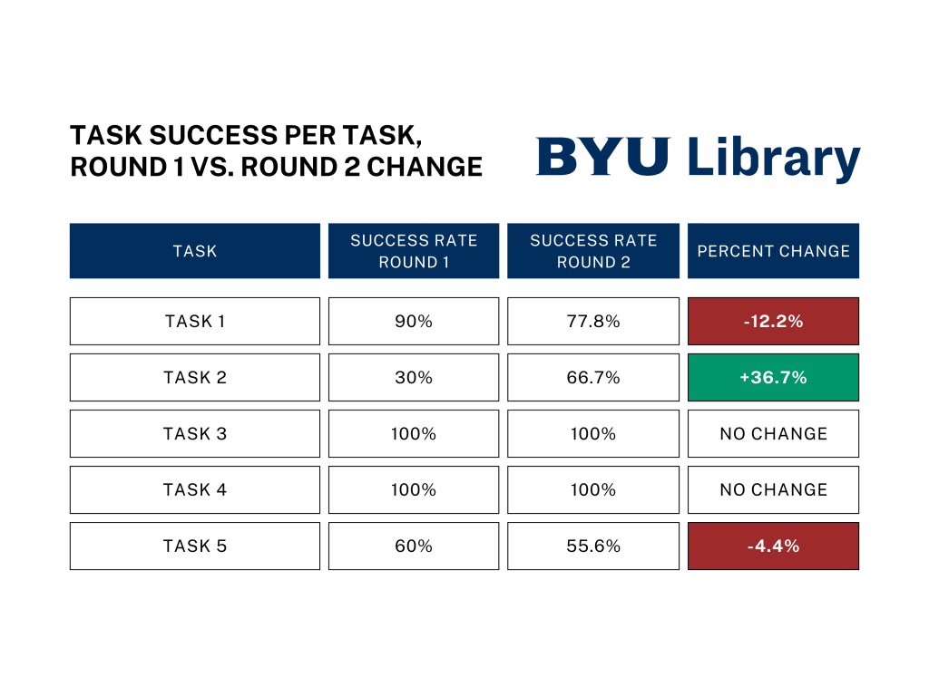
- Quantitative analysis–compared task success rate with previous round of tests
Feedback
- I expected for the task success rate to go up for each task. Unfortunately, the success rate only improved for one task and decreased or had no change for the others:

- Since the extra hints did not lead to nearly as much improvement as I expected, I suggested implementing much more blatant hints or rethinking the two-tabbed approach altogether.
Results
Although we never settled on a satisfactory solution while I was on the project, the insights I delivered in research reports allowed my team to know that we needed to keep iterating. In addition, a task-based and quantitative approach to testing was crucial. Test participants said they liked the interface, but they were not able to complete basic tasks I asked them to do with it. When I compared the results of the same test before and after adding hints, there was not enough improvement. My research will lay a foundation that the library needs to create a search interface that provides well-prioritized search results for users without accidentally hiding any results.
